DeCo

Bridging the gap between complex on-chain data and effortless

trade execution through a secure, AI-driven chat interface.

Bridging the gap between complex on-chain data and

effortless trade execution through a secure, AI-driven chat interface.

Bridging the gap between complex on-chain data and effortless trade execution through a secure, AI-driven chat interface.

Live site

In Development

The Context

DeCo is an AI-powered copilot for decentralized finance, making DeFi accessible to everyone, not just experts.

DeCo lets users connect a crypto wallet, see all their DeFi positions in one unified dashboard, and use natural-language conversation to understand markets, assess risk, and act on optimized strategies, without needing to master complex DeFi interfaces. I was brought on as the UI/UX designer to design the complete product experience: the public landing page and the full authenticated app across Overview, Recommendations, Analytics, and AI Chat.

The Problem

DeFi's complexity, fragmented tooling, and information overload kept most users stuck on centralized exchanges.

Most users who owned crypto never ventured into DeFi because the interfaces were intimidating and disconnected. Those who did found their positions scattered across protocols with no unified view or guidance. And even experienced DeFi users struggled to turn raw on-chain data into confident investment decisions, there was no intelligent layer translating complexity into clarity.

Client

DeCo

Year

2026

Duration

2 Months

Type

DeFi

Industry

Web3

Scope

UI/UX
Wireframe
Digital Design
Design System

The Objectives

Design and deliver a dark, modern DeFi copilot that makes portfolio tracking, AI-driven recommendations, risk analytics, and conversational investing feel powerful yet effortless, for newcomers and experienced DeFi users alike.

This involved a full UX design thinking process: deep user research, synthesis, user personas, journey mapping, user flows, design system creation, and high-fidelity screens across the landing page and all 5 core application screens.

The Approach

  1. EMPATHISE

2. DEFINE

3. IDEATE

4. DESIGN

5. TEST

  1. EMPATHISE

2

3

4

5

I started by understanding why the majority of crypto users never made it into DeFi.

  1. What specifically made DeFi interfaces feel intimidating to newcomers?

  2. What did experienced yield farmers lose by not having a unified view?

  3. What would it take for a risk-conscious investor to trust an AI with their portfolio?

I ran research across DeFi platforms, user communities, and competitor products.

  1. Studied existing DeFi tools, Zapper, DeBank, Zerion, and protocol-native dashboards.

  2. Reviewed user discussions on DeFi subreddits, Twitter/X, and Discord communities.

  3. Mapped the friction points across the full DeFi user journey, from wallet connection to strategy execution.

1

2. DEFINE

3

4

5

I translated research into clear product requirements across three critical lenses.

  1. What did each user type need to feel in control of their DeFi portfolio?

  2. What did DeCo need to build trust and drive meaningful engagement?

  3. What did non-custodial security and AI transparency demand from the design?

Core Design Problem Statement

DeFi users need a single, intelligent interface that unifies their portfolio data, explains risk in plain language, and surfaces AI-driven recommendations with full reasoning, so they can invest smarter in DeFi without losing control of their assets.

1

2

3. IDEATE

4

5

I mapped four core user flows before designing a single screen.

  1. What was the fastest path from landing page to a meaningful portfolio insight?

  2. How does a recommendation move from AI suggestion to signed transaction?

  3. How does the AI Chat connect to the wider portfolio and analytics experience?

I generated concepts for each product surface and how they interconnect.

  1. Prioritized the onboarding and overview flows — the highest-stakes first impression.

  2. Designed the recommendation flow to enforce user review and explicit approval at every step.

  3. Considered loading, empty, error, and success states throughout all screens.

1

2

3

4. DESIGN

5

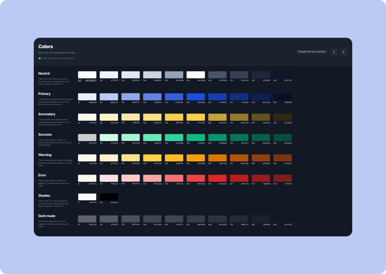
I built a dark, modern fintech design system before designing a single screen.

  1. Deep navy backgrounds with electric blue as the primary action accent.

  2. Green and red exclusively for gains and losses; amber reserved for warnings.

  3. Built reusable components: KPI cards, data tables, charts, chat bubbles, AI response cards, status chips, and modals.

I delivered high-fidelity designs across the landing page and all 5 core app screens.

  1. Persistent collapsible sidebar with Overview, Recommendations, Analytics, Chat, and Alerts navigation.

  2. All screens designed for desktop with responsive considerations for tablet and mobile.

  3. Loading, empty, error, and success states applied consistently throughout.
From the start, there were layers of complexity to navigate, designing an AI-powered DeFi platform from scratch while making it feel approachable and intelligent for users ranging from complete newcomers to experienced yield farmers. It was a real challenge to present complex on-chain data, risk metrics, and AI recommendations in a way that felt clear and trustworthy, without stripping away the depth that power users needed.


Throughout the project, I went through multiple wireframe iterations and had extensive conversations about the nuances of each screen, from the wallet connection flow to the AI chat interface to the portfolio analytics. On top of that, the UI was designed to feel confident and in control, so users could focus on making smarter investment decisions, not on deciphering what the data in front of them actually meant.

"Sodiq brought both design clarity and strategic thinking to DeCo. He understood the challenge of making DeFi feel accessible without dumbing it down, and the result speaks for itself — a product that looks sophisticated, feels intuitive, and builds trust from the very first screen. Exactly the design partner a Web3 product needs."

"Sodiq brought both design clarity and strategic thinking to DeCo. He understood the challenge of making DeFi feel accessible without dumbing it down, and the result speaks for itself — a product that looks sophisticated, feels intuitive, and builds trust from the very first screen. Exactly the design partner a Web3 product needs."

Smitha Shivakumar

DeCo Founder

1

2

3

4

5. TEST

I validated the designs through usability testing with users matching all three target personas.

  1. Shared the interactive prototype with a DeFi newcomer, an active yield farmer, and a risk-conscious investor.

  2. Observed wallet connection, dashboard orientation, AI chat interaction, and recommendation review.

  3. Focused sessions on the onboarding flow, AI Chat response clarity, and recommendation trust signals.

I gathered feedback and iterated on the highest-friction and lowest-trust moments.

  1. Identified where newcomers hesitated at wallet connection due to unclear permission language.

  2. Used findings to strengthen trust signals, improve AI response formatting, and clarify recommendation reasoning.

  3. Confirmed that the persistent floating chat button significantly increased AI engagement across screens.

What Tested Well

  1. KPI cards on the Overview gave users an immediate, confident sense of their portfolio status.

  2. The floating chat button made the AI feel accessible without interrupting the main interface.

  3. Suggested prompt chips in Chat dramatically reduced hesitation for newcomers unsure what to ask.


What Needed Iteration

  1. The wallet connection permission screen needed plainer language, “read-only” needed explaining.

  2. Recommendation cards needed the risk level more visually prominent before the Apply CTA.

  3. The Analytics risk metrics needed status labels (e.g. Good / Caution / High) alongside the raw numbers.

Final Improvements Made

  1. Added a one-line plain-English summary to the wallet permission screen: “We can only view your portfolio — we cannot move your funds.”

  2. Introduced a colour-coded risk badge (Low / Medium / High) at the top of every recommendation card.

  3. Added status labels to all key risk metrics in the Analytics screen alongside their numeric values.

Success Metrics (Targets)

  1. Wallet connection rate from landing page: ≥15% of visitors.

  2. Week-1 retention of connected users: ≥40%.

  3. Chat engagement per session: ≥50% of users.

  4. Recommendation acceptance rate: ≥20%.

  5. Time to first insight after connecting: <60 seconds.


  1. Wallet connection rate from landing page: ≥15% of visitors.

  2. Week-1 retention of connected users: ≥40%.

  3. Chat engagement per session: ≥50% of users.

  4. Recommendation acceptance rate: ≥20%.

  5. Time to first insight after connecting: <60 seconds.


  1. Wallet connection rate from landing page: ≥15% of visitors.

  2. Week-1 retention of connected users: ≥40%.

  3. Chat engagement per session: ≥50% of users.

  4. Recommendation acceptance rate: ≥20%.

  5. Time to first insight after connecting: <60 seconds.

I delivered a complete, developer-ready DeFi copilot, including a landing page and all five core app screens, designed to make complex DeFi investing feel intelligent, clear, and safe. The five screens (Overview, Recommendations, Analytics, Chat, and Alerts) give users a full view of their portfolio, along with AI-guided insights and timely risk notifications.


The product was designed to serve three types of users: newcomers, yield farmers, and risk-conscious investors. Four key user flows were mapped, covering onboarding, recommendations, AI chat, and risk assessment, so each audience has a clear path to the guidance they need. A unified dark fintech design system ties it all together and is ready for developer handoff, giving the build a consistent and polished foundation.

More work this way

More work this way

See all works

Caravan Multisig Vault

Web3

Bitcoin

Eliminating single points of failure with stateless, open-source Bitcoin multisig coordination designed for ultimate self-custody.


Eliminating single points of failure with stateless, open-source Bitcoin multisig coordination designed for ultimate self-custody.

View project

RMC Portal

EdTech

School Management System

Giving students, parents, and staff a single, secure home for results, fees, and school records, so nothing gets lost between the classroom and the front office.

View project

Let’s work together

arilewolasodiq@gmail.com

+234 703 666 1092

Socials

Others

Upwork

Contra

2026 Arilewola Sodiq. All rights reserved.

Let’s work together

arilewolasodiq@gmail.com

+234 703 666 1092

Socials

LinkedIn

X (Twitter)

TikTok

Instagram

Others

Upwork

Contra

2026 Arilewola Sodiq. All rights reserved.

Let’s work together

arilewolasodiq@gmail.com

+234 703 666 1092

Socials

Others

Upwork

Contra

2026 Arilewola Sodiq. All rights reserved.

Create a free website with Framer, the website builder loved by startups, designers and agencies.