
Durom's Touch Clinic (DTC)
Live site
In Development

The Context
Durom's Touch Clinic needed a digital platform that made healthcare access simple and trustworthy for real patients.
DTC is a web-based telemedicine platform designed to let patients register, book appointments, upload medical information, and receive feedback from their doctor online. I was brought on as the UI/UX designer to design the complete experience, covering both the patient-facing interface and the doctor's dashboard, across mobile and desktop.
The Problem
There was no seamless digital experience that made telemedicine feel secure and easy for everyday patients.
Healthcare platforms are often complex, clinical, and intimidating, especially for patients who are not technically confident. DTC needed an interface that simplified every step: registration, payment, appointment booking, and medical file sharing, without sacrificing the trust and clarity a healthcare platform demands.
Client
DTC
Year
2026
Duration
2 Months
Type
Clinic Management
Industry
Healthcare
Scope
UI/UX
Wireframe
Digital Design
Design System
The Objectives
Design and deliver a simple, clean, and trustworthy telemedicine platform for DTC that any patient can confidently use, with a focus on clarity, security, and real-world usability.
This involved a full UX design thinking process: deep user research, synthesis, user personas, journey mapping, user flows, design system creation, and high-fidelity screens for all 7 core flows of the platform across both mobile and desktop.
The Approach
EMPATHISE
2. DEFINE
3. IDEATE
4. DESIGN
5. TEST
EMPATHISE
2
3
4
5
I started by understanding what made patients hesitant to trust a digital healthcare platform.
Studied existing platforms, Babylon Health, Teladoc, and local telehealth services.
Reviewed user feedback and complaints about healthcare app usability online.
Mapped out the friction points in typical patient registration and booking flows.


1
2. DEFINE
3
4
5
I translated research into clear product requirements across three perspectives.
What did patients need to feel safe and confident using the platform?
What did DTC need to build credibility and retain patients?
What did the technical scope demand from a UI perspective?
Core Design Problem Statement
Patients need a telemedicine platform that makes registration, payment, appointment booking, and medical file sharing feel secure and effortless — so that seeking healthcare online feels as trustworthy as walking into a clinic.

1
2
3. IDEATE
4
5
I mapped out complete user flows for both the patient and doctor before designing any screen.
I generated concepts for both the patient experience and the doctor dashboard.
Prioritized the registration and booking flow, the most critical patient journey.
Designed the doctor dashboard for speed, every key action within two taps.
Considered empty, loading, error, and success states throughout both surfaces.


1
2
3
4. DESIGN
5
I built a design system first, then designed every screen with full consistency.
Reviewed the pre-defined colour palette for accessibility and contrast compliance.
Built reusable components — buttons, inputs, cards, modals, alerts, form states.
Maintained a mobile-first approach with intentional desktop layouts for every screen.
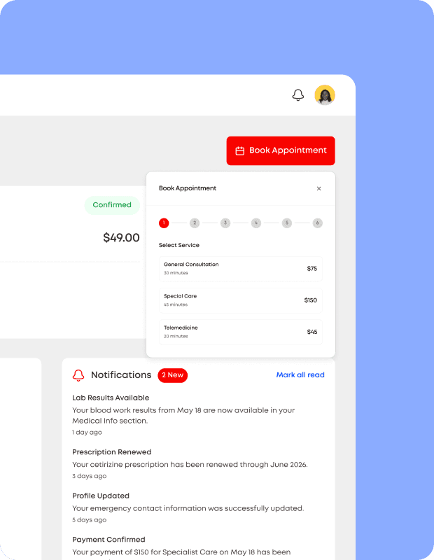
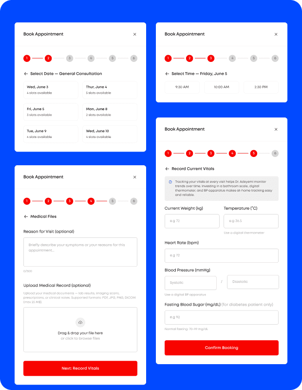
I delivered high-fidelity designs across all 7 core flows of the platform.
Landing page, registration & payment, login, patient dashboard, doctor dashboard, appointment booking, file upload
All 4 UI states designed consistently — loading, success, error, and empty
Both mobile and desktop versions designed intentionally for all screens




Dr. Stephen
Founder, Durom’s Touch Clinic

1
2
3
4
5. TEST
I validated the designs through usability testing with users matching both personas.
Shared the interactive prototype with patients and a clinical reviewer.
Observed how users navigated from the landing page to a confirmed appointment.
Focused test sessions on registration, file upload, and appointment booking.
I gathered feedback and iterated on the most friction-heavy moments.
Identified where patients hesitated or lost confidence during the flow.
Used findings to refine payment reassurance, upload guidance, and confirmation screens.
Confirmed that the step-by-step registration felt manageable and trustworthy.
What Tested Well
Landing page clearly communicated what DTC offered and who it was for.
Step-by-step registration with progress indicator reduced user anxiety.
Booking confirmation screen gave patients immediate reassurance.
What Needed Iteration
Passport upload step needed clearer guidance on accepted file formats.
Doctor dashboard patient list needed stronger visual hierarchy for unread cases.
Vital signs form needed inline tooltips explaining each field for non-clinical users.
Final Improvements Made
Outcome Confirmed
All test users completed the booking flow without dropping off.
Patients described the platform as “safe-looking” and “easy to follow”.
Dr Stephen confirmed the dashboard gave him everything he needed in one view.
DeCo
AI
Web3
DeFi
View project
RMC Portal
EdTech
School Management System
Giving students, parents, and staff a single, secure home for results, fees, and school records, so nothing gets lost between the classroom and the front office.
View project